Improving the experience of collecting parts from a smart locker
Overview
Smart lockers provided field service engineers timely access to critical parts, resulting in quicker problem resolution and meeting important service-level agreements. An app granted access, which was available in eight languages for both iOS and Android.
Research
A limitation of this project was not being allowed access to users. Instead, the product design team learnt about the user’s needs and behaviours indirectly. We watched video recordings, listened to feedback from other stakeholders, sat with support services, and performed the tasks ourselves.
Initial concerns
- App was unintuitive and required costly training to learn how to use.
- Users had to visit two different places in the app to collect a package.
- Users were choosing the wrong action to complete tasks, resulting in inaccurate data on the system.
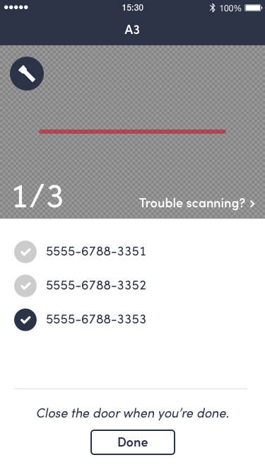
- Users weren't always confirming collection of packages by scanning them out of the locker, resulting in unreliable inventory data.
- Inaccessible to a diverse range of people.
- Usability suffered in inclement weather conditions.
Observations
- While sitting with customer support, I overheard an engineer struggling to describe which locker was causing a problem. There was no system for identifying a specific locker at a location, which may contain a hundred lockers or more.
- Watching a video of an engineer collecting a package, I noted that the engineer had to place their phone in the locker or put it in their pocket so that they could use both hands to remove a package.
Task modelling
- I’ve received notification of a problem and…
- I’m told what parts I need and…
- I know what parts I need and…
- I don’t know what parts I need and…
- I’m in the middle of fixing a problem and I realise I need a specific part and…
- I’m at a location with a locker.
- I’m at home.
- I’m in a vehicle (moving).
- I’m at a job site without a locker and can’t leave.
- I’m somewhere else.
- I’ve received notification of a problem and…
Find the correct parts on the system…
- near to where I am now.
- near to where I need to be.
- enroute to where I’m going.
Insights
- Help the user find the correct part quickly—search by description (eg: 1/2” screw with hex head) or identify the part using computer imaging by taking a photo of it.
- Don’t assume a location—provide smart options.
Order the part at a specific location.
Find and travel to the locker (if not already there).
Insights
Connect with map/journey planning functionality.
Unlock the locker door using the phone app.
Insights
This is a point of failure. What alternative mechanisms are available? Could we remotely open a locker?
Find the correct door.
Insights
Help the user find the correct door.
Open the door.
Insights
Accessibility needs (eg: can the user reach the locker?)
Find the correct packages.
Insights
Some lockers contain several identical-looking brown packages with white labels and barcodes on them. Users would benefit from assistance to find the correct one. Possible solutions include augmented reality to read the barcodes and identify the package.
Remove the packages from the locker.
Insights
The height of the locker and weight of the package could affect an engineer’s ability to collect it—leverage information about the package and user to select an appropriate locker on delivery and alert the user if potentially problematic.
Confirm receipt of packages.
Insights
How will the system handle damaged or missing labels?
Closed Close the locker door.
Insights
What happens if there is no data connection to sync data?
User journey
Using BPMN, I mapped the user’s journey, including both happy and unhappy paths.
Understanding the journey enabled me to identify additional problems and opportunities to improve the user experience.
Considerations
Prepared an extensive set of factors that may apply at various stages of the task.
Environmental conditions
- Weather
- Dry
- Light rain
- Heavy rain
- Rained
- Snowing
- Snowed
- Temperature
- Very hot
- Hot
- Mild
- Cold
- Very cold
- Noise
- Quiet
- Loud
- Light
- Sunlight/bright
- Overcast
- Sunrise/sunset
- Dark/poorly lit
- Wind
- None
- Mild
- Windy
- Very windy
- Area
- Wet floor
- Icy ground
- Sandy
- Animals
- Geckos
- Bears
- Monkeys
- Insects
- Cockroaches
- Mosquitos
- Flies
Locker
- Dimensions
- Height
- Width
- Depth
- Access
- Blocked
- Site Access
- Open
- Restricted
- Blocked
- Door
- Damaged
- Jammed
- Won’t open
- Others
- Above
- Below
- Beside
Device
- Type
- Mobile
- Tablet (Kiosk)
- Alternative Access
- Data
- None
- Mobile Patchy
- Mobile Strong
- Mobile Problem
- WIFI
- Battery
- Okay
- Low
- Empty
- Condition
- Okay
- Damaged screen
- Unusable
- Bluetooth
- None
- Off
- On 3
- On 4 LE / 5
User
- Dimensions
- Very short
- Average height
- Very tall
- Obese
- Assistance
- Glasses
- Crutches
- Walking frame
- Wheelchair
- Support animal
- Hearing
- Okay
- Impaired
- Deaf
- Sight
- Far-sighted
- Colour blind
- Impaired
- Use of Hands
- Both
- One
- None
- Handedness
- Right
- Left
- Cross-dominance
- Ambidexterity
- Cognitive
- Memory limitations
- Reading
- Dyslexic
- Illiterate
- Language
- Same as default
- One of alternative options
- None of the available options
Package
- Dimensions
- Height
- Width
- Depth
- Weight
- Kg
- Identifier
- Unique (serialised)
- Not-unique (non-serialised)
- Condition
- Good
- Bad
Locker identification system
Wireframes
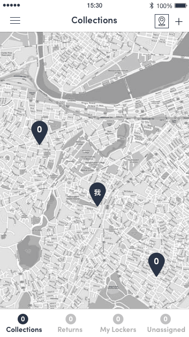
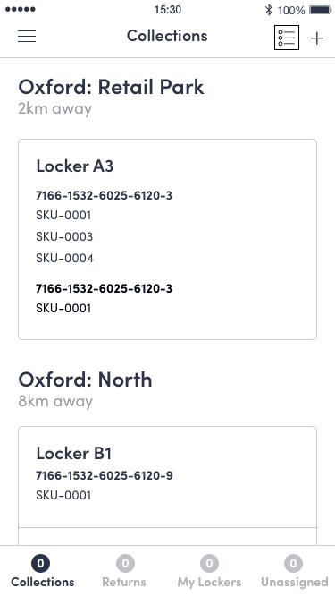
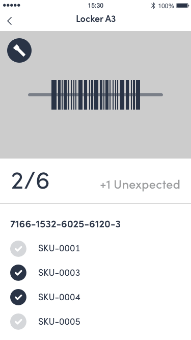
- Explored different options.
- Presented select wireframes to stakeholders.
- Iterated further based on feedback.
Mockups
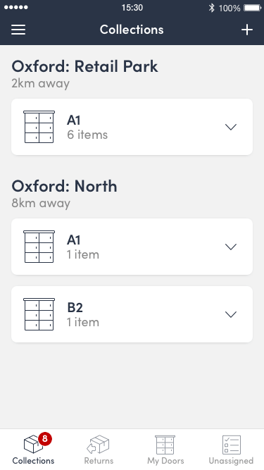
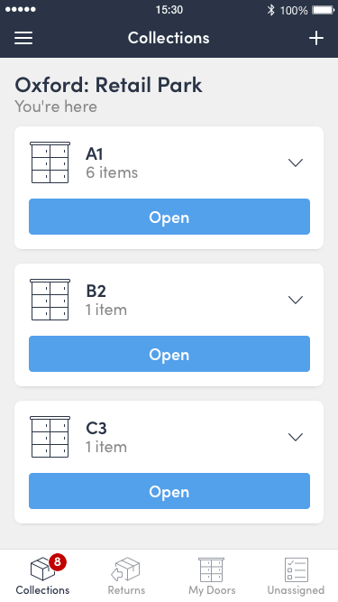
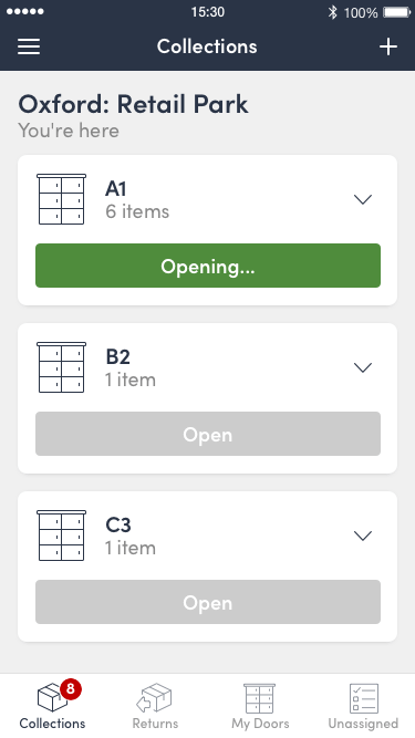
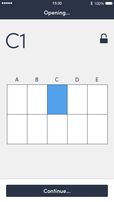
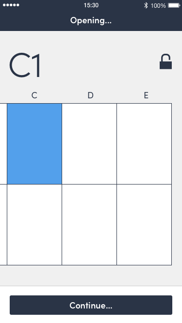
- Prepared detailed designs using elements from a growing pattern library and initial design system.
- Worked with an illustrator to create bespoke icons.
- Collaborated with a motion designer to produce animations and transitions.
Production
- Defined specifications, including responsive behaviour.
- Prepared assets—optimising SVG and PNGs for smaller and faster downloads.
- Worked with a product owner to slice and create user stories.
- Worked with developers in sprints to implement the design.
Training videos
Provided creative direction for a series of animated training videos.
Finger movement overlays
Screen styles


Acknowledgements
Most of the thought and work that went into this project was done while I was the lone UX/UI designer. However, after building a more diverse design team, we were able to further refine many elements together.
Special thanks to Sophie Pilley (UX/UI/Motion), Kirstin Clark (UX/Illustration), Toby Weinel (Animation) and Richard Shapiro (Product Owner).